Tuesday, 22 March 2011
A2 Media Progress Post
I have now finished filming the narrative side to my video. All i have left to do now is upload this video to final cut pro, so i can edit my footage with the performance visuals i recorded, over the track. I have also completed my poster, after taking time to research what conventional album posters look like. I used Adobe illustrator to do this and and very happy with the results.
Monday, 21 March 2011
Poster
 This is my finished poster design for my chosen track. I drew inspiration from a number of posters i looked before i began designing this finished poster. I chose to use a faded image as the background as i saw it in my research and felt it was very effective in setting the mood for the album or single an audience is looking to buy. I chose this picture as i thought it fit with the mood of the song, and with the lyrics about making decisions, as the actor looks as if he is pondering or deciding on something. I also decided to keep it simple, with dark and bleak looking colours, to create an air of mystery around the band and song. I also kept all of the writing to the same font, so that my poster looked professional like the other posters i looked at. I also noticed in my research that other posters had the record label logo in the bottom corner, so i followed suite and put the Island Records logo in the bottom left corner. Audience Feedback
 Ryan: This looks good because it matches up with the digipak i saw earlier. I said the same before, i think the faded colour looks good because it makes the character look lonely or sad, and looks similar to the black and white digipak.
Josh: I like the font used in the writing, because its all the same and looks realistic. The way it is centred helps it to look professional, especially with the websites and logo's at the bottom.
Meg: The character in the picture looks good, i like the way he fits into the screen with space on his right to show where he's looking. His expression fits in with the song and the dark depressing colours used. Maybe the picture could of been black and white though, as you can see some colour but its just very faded. It's not a big issue but it would make it link in more with the digipak.
Sunday, 20 March 2011
Poster Construction Screen shots
I started by uploading my picture, to which i then changed the opacity to create this faded effect. 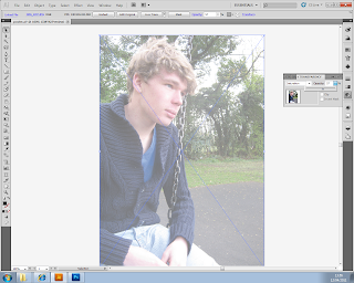 I drew a black rectangle to cover the image, and did the same as before, changing the opacity of the rectangle to create a dark shadow like effect over the top of my image.

I then proceeded to add wording over the top of my images to create my final poster design.
 I drew a black rectangle to cover the image, and did the same as before, changing the opacity of the rectangle to create a dark shadow like effect over the top of my image.

I then proceeded to add wording over the top of my images to create my final poster design.

Friday, 18 March 2011
Poster examples
For inspiration and an insight into conventions and ideas for album posters, i researched a few indie bands posters to see the different techniques used to promote their new albums. Here are three examples i looked at that showed both positive and negative techniques.  This poster is for an indie band, The Vaccines' new album. Personally I really liked this album poster as I felt the simplicity of it made it very effective. If there was too much information or too many things going on on this photo, it may not be as effective in promoting their new album, as only the important information is included. I also liked the faded background, as it gives a subtle message as towards the theme of the album. I will take inspiration from both of these points as i feel that they will very effective as a poster for my chosen band and track.
  I also thought this poster, for the new Glasvegas album, was quite effective in promoting this album. Similar to The Vaccines' poster, I liked the faded image used in this poster. Although it was used in a different way, I thought it looked quite unusual and eye-catching, making it stick out in an audiences mind. I also liked the dark colours used, creating a mysterious shadow like effect across the poster. I feel that using dark colours on my poster will make it look quite mysterious and interesting, so would be effective in engaging an audience into buying the single.
 Of all the album posters i looked at, I thought that this one by British Sea Power was the least effective. I didn't like the way in which several colours were used, and i felt they clashed making the poster less aesthetically pleasing. I will take this on board when creating my poster and try not to use too many colours with the risk of it clashing. Despite this, i liked how all of the writing on the poster was the same font, as it made it look quite professional. When creating my poster i will do the same, and use the same font in all writing to make it look professional.
This poster is for an indie band, The Vaccines' new album. Personally I really liked this album poster as I felt the simplicity of it made it very effective. If there was too much information or too many things going on on this photo, it may not be as effective in promoting their new album, as only the important information is included. I also liked the faded background, as it gives a subtle message as towards the theme of the album. I will take inspiration from both of these points as i feel that they will very effective as a poster for my chosen band and track. I also thought this poster, for the new Glasvegas album, was quite effective in promoting this album. Similar to The Vaccines' poster, I liked the faded image used in this poster. Although it was used in a different way, I thought it looked quite unusual and eye-catching, making it stick out in an audiences mind. I also liked the dark colours used, creating a mysterious shadow like effect across the poster. I feel that using dark colours on my poster will make it look quite mysterious and interesting, so would be effective in engaging an audience into buying the single.  Of all the album posters i looked at, I thought that this one by British Sea Power was the least effective. I didn't like the way in which several colours were used, and i felt they clashed making the poster less aesthetically pleasing. I will take this on board when creating my poster and try not to use too many colours with the risk of it clashing. Despite this, i liked how all of the writing on the poster was the same font, as it made it look quite professional. When creating my poster i will do the same, and use the same font in all writing to make it look professional.
 Monday, 7 March 2011
A2 Media Progress Post
Over the past few weeks, planning and filming my video has taken priority as i have finally completed all filming of my clip. With already having filmed the performance visuals to my video I recently completed filming the other side, the narrative. I set out a plan of the different locations I would use and what each character would do at these locations. I then took my characters to each place and filmed them according to my storyboard and plans, making some minor adjustments as i went (such as filming a couple playing together on a rickety bridge at a childrens park). Once the filming was complete i took the tape to my next lesson and uploaded it to the computer. I have now started editing all of my footage to make it fit with the song played underneath.
Subscribe to:
Comments (Atom)